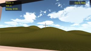
 One of the funniest Let’s Play quips I’ve heard about Dehoarder comes from when capnduck is staring out the window, looking at that horrid green, flat ground and default blue cloudless sky. “The Netherlands […] is flatter than ever today,” the line goes.
It’s a fair cop. In the throes of the Ludum Dare competition, I paid as little attention as possible to the surroundings of the “house” as possible. Since it wasn’t important to gameplay, I just used a simple green cube for the entire game world to sit on.
With Dehoarder 2, that changes. Starting with the engine from Dehoarder 1, the first changes are some cosmetic improvements. Terrain and skybox is in place. Some more terrain variety and trees and other outdoor decor are yet to come, though it’s amazing how much just this little does.
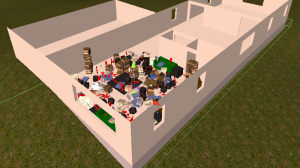
 I have a rough draft of the first floor of the house in place. I always wanted the game to span more than one room, there just wasn’t enough time in the competition. In Dehoarder 2, I have plans for at least 8 rooms, counting the yard as a “room”. Here you can see an editor’s-eye view the original game taking place in the front room of the house, with more rooms behind and a garage to the side.
While some junk placement will be random, there will be far more strategic junk placement in Dehoarder 2, now that there is time for proper level design. Piles of high-willpower junk will block access to key areas. Story will play a role as well, with the main character’s self improvement driving the plot and progress through the house.
Other planned features include more varied challenges (beyond the collect x item in y time variety), bursting closets, more types of vermin, many more types of junk, and an improved building inspection system.
