It has now been exactly one month since the launch of Prepare For Warp on Steam Early Access. The launch went pretty smoothly and the game was pretty stable out of the gate with minimal bugs and issues discovered since.
It feels like it has been a lot longer than a month, with everything that has been going on in life. I won’t go into personal details, but suffice to say in some aspects, this has been the most challenging month in recent memory, and that is saying a lot. I had a lot thrown at me, but I acquitted myself well in handling it.
Despite these challenges, I HAVE been able to make some considerable progress on the “It’s Under Control” update for Prepare For Warp. There were a lot more underlying concerns to be addressed for the features in this update than I anticipated, as well.
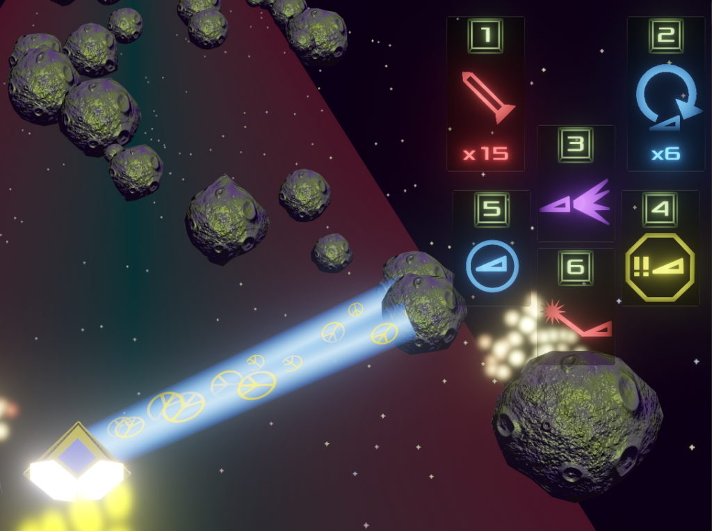
The most noticeable change is already in the “bleedingedge” beta release track: The new HUD. I was able to start bringing forward the bloom/glow effects into the UI layer, and have used this to great advantage to stylize a lot of the UI look and feel.
On the PC version, the HUD no longer consists of onscreen buttons. Instead, a display of ability “instruments” and their associated controls are clustered on the right side of the screen, outside of the main track area.
All UI icons use a special custom shader that is programmed to make the icons look and feel like retro-style automotive dashboard indicator lights, complete with a backlight lamp. The brightness of the icons can be animated, allowing the icons to give very noticeable feedback when their associated actions or conditions are triggered. The brightness of corresponding text can also be animated.
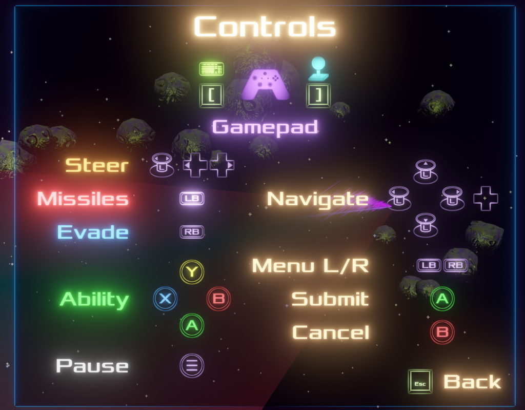
The displayed controls will always show the relevant controls for the device currently in use. In my testing, I was able to switch between keyboard, 360 controller, and USB/HID controller seamlessly.
Speaking of controls, one of the main priorities for this release, the “Raison du nom” for the release title “It’s Under Control”, is providing the ability to remap the controls. It turns out this is a pretty tall order, at least to do it properly.
For one, if you want fancy icons for the controls, rather than plain boring text, you need to create the icons, for every controller button and keyboard key in existence. You do get to set the extent of what “existence” means; currently in Prepare For Warp it means US keyboard layouts, Xbox controllers, PS4 controllers, and generic USB/HID controllers. Eventually more international keyboard layouts will be supported and the hooks are all there to do so, but I had to draw a line that allowed me to complete this task in a reasonable amount of time.
The building of these control icons is actually the start of a larger campaign to update all of the UI icons. Many of the existing icons were drawn 7 years ago when I was considerably less artistically able, and now I can do a better job and bring more consistency to the icon set. The building of the 181 control icons was also a good therapeutic task for getting myself back in the groove of working on the game after things skidded sideways.
From there I set out to build the UI for remapping the controls, only to discover (and this was predictable, shame on me) that I had to solve a lot of other UI considerations if I wanted to build this UI without introducing a bunch more technical debt that would have to be reworked later.
The biggest thing I needed here was the UI foundation, essentially the components that would structure the UI and make it consistent, and the components that would form the main flow. I built this foundation such that controller-based navigation would be its main focus, and clicky-clicks with the mouse would be secondary but accepted. There are three levels of navigation within this foundational framework. Up/Down/Left/Right will navigate within a single “tab” on a panel. The shoulder buttons will navigate among “tabs” in a panel, and the submit and cancel buttons will navigate between panels. Simple and elegant. On the PC side, eventually all UI, including the Store, will follow this model.
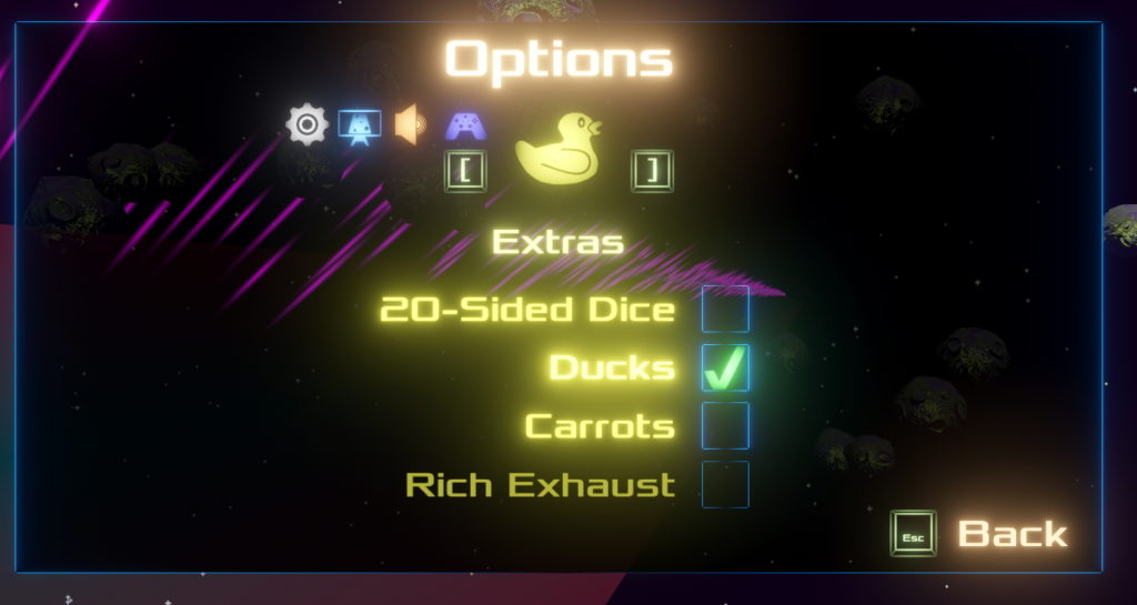
I went back and forth between building out this new UI foundation, and using it to build out the control remapping interface. Then, since the control remapping interface lives within the options menu, I set about rebuilding the current options menu using the new UI foundation, extending that foundation as necessary. Finally, I integrated the control remapping UI into the options menu.
All options currently available on the options menu have been migrated to the new options menu. I have control rebinding working for “happy path” cases, and am still working to nail down as many edge cases as possible before pushing these changes to the “bleedingedge” beta. I’m hoping to release a new “bleedingedge” build at some point over the next couple weeks, as holiday schedule allows. This next build will be considered feature-complete for the “It’s Under Control” update, and will just need some testing before it is promoted to stable.
Looking a little further down the road, good progress is also being made by Arvex on the new Player Ship models that I have commissioned from him. We just successfully completed our first milestone for the ship models a day early, meeting the goal of having rough drafts for the first two ships models delivered. The hope is that one or two updates down the road from “It’s Under Control”, we will have these first two ships available to unlock.
Knowing my post cadence and what is in store for me these next couple of weeks, I’m sure this will be my last “official” update for the year. These days, I more frequently issue less official updates on the COGG Discord server, usually in the Prototype and Play Prepare For Warp channel that they so graciously carved out for me. Everyone have a safe and happy Holiday season, whatever form that may take for you, and I will see you in the new year!


